
The Art of Using White in Interior Design
White is one of the safest colours to use in interior and exterior design, and one of the easiest to get wrong. When you first think about white you may think of it as a single colour but there are hundreds of 'whites' you can choose from.
On a paint chart it may look simple and you pick something you like but when you test it on wall it's nothing like you expected. As with every colour, you find it looks different on each wall and at different times of day.
A cool white can feel crisp in one room and icy blue in another. A warm white can look soft and elegant or yellow beside the wrong stone, tile or timber.
When used well, white is not plain. White can highlight architectural features and be used to define spaces. It can make a compact room feel calmer and larger, a dated home feel newer and cleaner, and a new build feel more timeless. However, in the wrong applications white can feel sterile, flat, stark or unfinished.
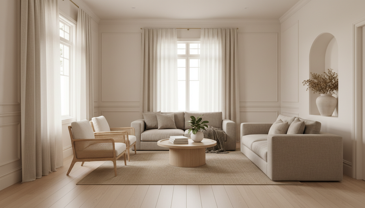
As an interior design choice white works best when it is treated as a material, not just a colour. Its undertone, sheen and texture matter as much as the name on the tin.
What white symbolises in interior design
White carries a lot of meaning, which is one reason it appears so often in homes, galleries, hotels, kitchens, bathrooms and coastal buildings. At its best, white symbolises:
Cleanliness
This is why it appears so often in bathrooms, laundries, kitchens, clinics and food spaces. It gives a visual sense of hygiene and freshness.
Clarity
White reduces visual noise. It lets the eye rest and allows furniture, artwork, landscape views and architectural forms to become the focus.
New beginnings
In renovation, white often marks a reset. Painting dark, dated or visually busy rooms white can make a home feel renewed before major furniture or styling changes happen.
Simplicity
White supports minimal, contemporary and Scandinavian inspired interiors because it removes excess decoration and highlights proportion.
Purity and calm
Soft whites can feel peaceful, especially when paired with natural materials such as oak, wool, stone, rattan, linen and handmade ceramics.
Status and refinement
Crisp white stone, white render, white joinery and white walls can feel quietly luxurious when the detailing is well resolved.
That said, white is not neutral in every cultural or personal context. Some people associate it with hospitals, isolation or unfinished spaces, and some cultures associate white with death and sadness.
The challenge is choosing the right white for the right space.
The main advantages of using white
White has earned its popular place in renovation and building because it solves real design problems when applied well.
White makes spaces feel larger and lighter
White reflects more visible light than darker colours, so it can help brighten rooms that feel small or shaded. This is especially useful in apartments, terraces, hallways and older homes with smaller windows. A white ceiling can visually lift a room and white joinery can reduce the visual weight of large cabinetry.
However, this does not mean every small room must be white. A deep colour can be beautiful in a compact space but when the goal is visual openness, white is often the most effective starting point.
White creates a flexible backdrop
Renovations are expensive, and most people want choices that will last. White gives flexibility because it works with many design styles, such as:
Coastal interiors with pale timbers and soft blues,
Contemporary homes with black accents and concrete,
Classic interiors with panelled walls and marble,
Country homes with aged brass, timber and stone,
Minimal spaces with sculptural furniture and texture &
Mediterranean-inspired homes with limewash and terracotta.
As furniture, art or soft furnishings change over time, white usually adapts, giving rooms the ability to be adapatable and timeless.
White helps architectural details stand out
When the finish is right, white highlights form without making the design feel busy. This is why it works so well in both heritage renovations and clean-lined new builds.
White can be ideal to highlight architectural details such as cornices, skirting, wall panelling, arches, ceiling beams, staircases, built-in shelving, and door and window frames.
White can make a home feel more cohesive
Renovated homes often have a mix of old and new elements which may best be connected by white e.g. using the same white across ceilings, trims and internal doors can bring order to rooms with different flooring, ceiling heights or window styles.
In open-plan homes, white can also be particularly useful as a way of connecting the kitchen, dining and living zones together.
White can support thermal comfort on exteriors
For external walls and roofing, white and very pale colours can reflect more sun than dark colours. In warm Australian climates this can help reduce heat absorption on exposed surfaces.
However, that does not make white the answer for every exterior. Orientation, insulation, glazing, roof design, landscaping and ventilation matter, but for heavily sun-exposed facades, pale finishes often perform better than dark ones.
The drawbacks of using white
White is forgiving in some ways, but ruthless in others. It shows poor preparation and poor quality details very quickly.
Pros
Brightens rooms, supports many styles, feels clean, improves visual flow, highlights architecture, can help reflect heat outside.
Cons
Shows marks, can feel sterile, may glare in strong sun, exposes poor workmanship, undertones can clash, some whites date faster than expected.
White shows dirt, dents and daily life
Pure white walls, white grout, white benchtops and white floors can look stunning on handover day but real life is less polished.
White can make obvious:
Fingerprints around switches and handles,
Scuff marks in hallways,
Mould or soap residue in wet areas,
Cooking splatter near hobs &
Chips on cabinetry edges.
This does not mean white is impractical. It means placement matters e.g.:
A washable low-sheen paint in a hallway is more sensible than a flat, chalky finish,
Off-white grout often wears better than bright white grout &
A white marble-look surface with movement will be more forgiving than a flat white surface.
White can feel cold or clinical
The wrong white, or excessive use of white, can make a home feel like a showroom or a hospital. This can happen when whites, particularly cool whites, are used across every surface without texture, contrast or warmth.
A room with white walls, white tiles, white cabinetry, white stone and cool LED lighting can feel hard, even if every individual product is attractive.
White rarely works best alone. To avoid issues considering pairing white with:
Natural timber,
Warm metals such as aged brass or bronze,
Textured fabrics,
Handmade tiles,
Stone with movement,
Rugs,
Plants,
Soft, layered lighting &
Art with depth and personality.
White is deeply affected by light
In Australian homes light can be strong and direct. Cool whites can turn blue or grey in shaded rooms, and warm whites can appear cream, yellow or pink. A white exterior can look fresh on an overcast day and glaringly bright under the summer sun.
The safest approach is to test large samples on different walls and view them across the day. Do not choose white, or any colour, from a tiny swatch under retail lighting.

Where white works best
White can work in almost any space but it must be used appropriately.
Walls and ceilings
White walls and ceilings are a classic choice for good reason. They allow natural light to move through a home and help rooms connect.
For ceilings, many designers choose a clean white to create lift. For walls, softer whites are often more liveable than brilliant whites. In period homes, a warmer white can sit beautifully with decorative cornices, timber floors and original fireplaces. In contemporary homes, a cleaner white can suit sharp lines and minimal detailing.
One designer trick is to use the same white across a home on ceilings, walls, trims and doors, but vary the sheen. For example, matt ceilings, low-sheen walls and semi-gloss or satin on trims. This creates a seamless look while still giving durability where needed.
Kitchens, Bathrooms and Laundries
White kitchens, bathrooms and laundries remain popular because they feel bright, hygienic and versatile, particularly where natural light is limited. They also help large areas of cabinetry feel less bulky.
White works well when balanced with texture and contrast such as:
White cabinetry with timber floors or benchtops,
White stone with subtle veining,
White handmade tiles with uneven glaze, or coloured grout,
White cabinets with dark bronze, black or brushed nickel handles &
White walls with a natural stone splashback.
Exterior walls and facades
White exteriors have a long history across coastal, Mediterranean and modern architecture. In Australia, white weatherboards, white render and pale masonry can look crisp against a strong blue sky, native planting and timber decking.
White is excellent for:
Coastal homes,
Modern farmhouses,
Mediterranean-inspired renovations,
Brick homes being rendered or bagged &
Homes with strong landscaping.
The main caution is glare and maintenance. A brilliant white facade in full sun may feel harsh. Dust, rain streaks, cobwebs and garden debris may also show more on white surfaces. Off-whites, warm whites and chalky mineral finishes may age more gracefully than stark white finishes.

Joinery, trims and built-ins
White joinery can disappear into the wall which is helpful in smaller spaces. Floor-to-ceiling cupboards, wardrobes and bookshelves feel lighter when painted white or off-white, but choose the right finish to ensure durability.
For trims, white creates definition. Skirting boards, architraves and internal doors in a slightly crisper white can frame a room beautifully, highlighting craftsmanship in heritage homes.
How to choose the right white
Choosing white is mostly about undertone. The undertone is the subtle colour hiding inside the white, which might lean cool or warm.
A practical way to choose is to compare the white against fixed finishes that are already in the home and to test a sample pot in multiple places at different times of day.
It is critical to see how the white looks when next to the other materials, including flooring, benchtops, tiles, carpet, curtains and cabinetry.
If the home has warm oak floors, cream stone or brass fixtures, a warm white will often feel more settled. If the home has concrete floors, black steel, cool grey stone, silver fittings or crisp contemporary detailing, a neutral or cooler white may work better.
Warm whites
Warm whites contain hints of cream, beige, yellow or red, and feel soft, relaxed and welcoming. They usually work well with:
Timber floors,
Heritage homes,
Coastal interiors,
Natural fibres,
Warm stone,
Brass and bronze &
Rooms with cooler southern light.
Cool whites
Cool whites contain hints of blue, grey or green, and feel crisp, modern and sharp. They usuallly work well with:
Contemporary architecture,
Concrete,
Black-framed glazing,
Cool-toned stone,
Silver,
Minimal interiors &
Bright rooms with strong natural light.
Neutral whites
Neutral whites sit between warm and cool and are often the safest option when a home has mixed materials. They usually work well when:
A renovation includes both old and new elements,
Furniture styles may change &
The same white needs to run through several rooms.
Neutral whites are rarely dramatic but they are often the most flexible and liveable.
The best finishes for white surfaces
Colour is only part of the decision, as the finish and texture changes how white behaves.
Matt finishes look soft and elegant, but they can mark more easily. Low-sheen paint is a good everyday choice for walls because it balances softness with cleanability. Satin and gloss finishes suit trims, doors and joinery because they highlight features whilst handling touch and cleaning better.
For exteriors, smooth white render can highlight imperfections, whereas bagged brick, limewash-style finishes, textured render and weatherboards can give white more depth and help it age more naturally.

Designer tips for using white well
The strongest white interiors usually have three things in common: they have light, so the white has something to reflect; texture, so the room does not feel flat; and contrast, so the eye can understand the space.
Contrast does not need to be black and white. It can be based in colour and texture e.g. pale oak floorboards against white walls, linen against smooth plaster or garden greenery seen through a window. To ensure the right balance in a white room you need to consider the lighting, textures, finishes and furnishings as well as the paint colour.
A good white can make a space feel lighter, cleaner and timeless. The right white does far more than simply brighten a room, it responds to the light, complements the materials and enhances the proportions, bringing the entire space together with a sense of calm and cohesion.
Bella Living is an interior design and home and lifestyle hub creating and sharing information to improve lives and lifestyles by design. Visit out blog to explore more interior inspiration, design ideas and practical resources, to help you create nature inspired spaces you love.


Comments